459 search results
(0.021 seconds)
- Arnod by Craft Supply Co,
$20.00 Discover “Arnod – Serif Typeface” Robust and Refined Embark on a journey through the powerful aesthetics of “Arnod.” This serif typeface exudes a masculine aura, characterized by bold strokes and robust forms. Arnod doesn’t just communicate; it declares, ensuring that every design resonates with authority and strength. Industrial Elegance Navigating through the realms of industrial design, Arnod effortlessly aligns with the aesthetics of strength and precision. Here, it finds a space where its mechanical elegance and structured forms become a natural fit, enabling designs to embody an authentically industrial spirit.
 - Arnold Bocklin by Mecanorma Collection,
$45.00 - Arnolde Script by Mans Greback,
$59.00 Arnolde Script is a heavy script typeface. Drawn and created between 2020 to 2022, this logotype lettering has a distinct style and a strong personality. It has a bold expression and confident movements, and is perfect for a modern script logo or cool headline. Use underscore _ anywhere in a word to make an underline. Example: Love_letter Use multiple underscores to make different swashes. Example: Cute_____ness Use numbersign # after any letter to make a swash. Example: Welcome# Back# (Download required.) The typeface family consist of Regular and Italic. The font is built with advanced OpenType functionality and has a guaranteed top-notch quality, containing stylistic and contextual alternates, ligatures and more features; all to give you full control and customizability. It has extensive lingual support, covering all Latin-based languages, from Northern Europe to South Africa, from America to South-East Asia. It contains all characters and symbols you'll ever need, including all punctuation and numbers.
 - Arnold Boecklin by Linotype,
$36.99 The font, Arnold Boecklin, appeared in 1904 with the font foundry Otto Weisert. Traces of the floral forms of the Jugendstil can still be seen in this typeface. Alphabets of this type were mainly meant for larger point sizes, as on posters. A decorative feel was much more important than legibility, and Arnold Boecklin was of particular importance to the book design of the Jugendstil movement. Today the font is often used to remind people of “the good old days”.
 - Arnold Böcklin by URW Type Foundry,
$35.00 Arnold Boecklin is a true Art Nouveau font, evocative of outdoor cafes in the years prior to World War l. Arnold Boecklin seems to be telling a story, with its decorative curves and varying emphasis of strokes. The Arnold Boecklin font should be used for specific copy as in headlines or advertisements, bearing in mind its strong design. Arnold Boecklin is a trademark of Linotype GmbH and may be registered in certain jurisdictions.
 - Arnold Samuels by Samuelstype,
$24.00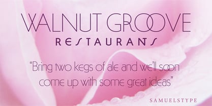
- 21 Heads - Unknown license

- 21 Emmerson by Deniart Systems,
$20.00 A bit grungy, a bit stern, 21 Emmerson is a tribute to my birthplace and was designed with punky headline posters in mind. The simple lines of this font are angular and sharp - great for party posters, invitations, labels, etc.
 - 21 Cent by Letterhead Studio-YG,
$45.00 21 Cent - not Century or Clarendon. This is an original font family designed from scratch. 21 Cent is named after a magical coin that brings good luck. And well, in honor of the 21st century, of course. 21 cent family is used in the almanac of the State Hermitage Museum, St. Petersburg, Russia. All members of 21 Cent family include the expanded character set of with support of Cyrillics, Central European and Baltic languages.
 - Lightbox 21 by Protimient,
$21.00 Lightbox 21 is a radical update of my previous version of a geometric sans serif. The design of the original Lightbox was fundamentally based on the idea of incorporating the proportions of the ‘Golden Ratio’ into each letterform; Lightbox 21 greatly improves on this concept by entirely abandoning it. The result is a much more readable, ‘natural’ typeface that retains elements of the original without being bound to it. Overall, Lightbox 21 has been designed to convey that classic feel of a geometric sans that makes the genre so tremendously enduring and versatile, as well as providing an effortless sense of class to whatever they are applied. Primarily intended for editorial work (i.e. short to medium length texts) or display settings, Lightbox 21 has a reasonably extensive character set, including support for Vietnamese, many currency symbols, arrows, and small caps. It also has OpenType support for nut fractions (via a stylistic set) and a barred alternate uppercase i and an alternate curled j.
 - Triole 21 by KaiserType,
$40.00 "Triole 21" is the name of a gothic script font designed by Bertram Kaiser. The forms of this so called "Rotunda" script are based on the manuscripts of italian calligraphers of the late 14th century. Inspiration for this project also comes from the calligrapher Lisa Beck. The glyphs were first written with a broad-nib and then digitized. The Open-Type font is equiped with multilingual (Latin-based) alternates, ligatures and oldstyle figures for various typographical purposes. It can be used for headlines and also stays legible in smaller textsizes for longer textpassages.
 - Marbold - Personal use only

- Crunold by Trustha,
$17.00 Crunold is a bold hand-drawn with dingbats as his mate. Inspired by today's popular designs, abstract shapes as an important element in both digital and print designs. Crunold is perfect for your creative projects. Because, a combination of typography, and the abstract shape of art. Makes your design perfect, also easier in the process. Crunold is perfect for branding, headlines, packaging, and many more.
 - Magnold by Hikhcreative,
$19.00 Magnold is a modern bold and elegant serif font. Magnold is well-suited for advertising, branding, logotypes, packaging, titles, headlines and editorial design.
 - LFT Arnoldo by TypeTogether,
$39.00 LFT Arnoldo began as an all-caps book cover typeface created during the rebranding of Oscar Mondadori, the most important Italian publisher, with over 4,500 titles from ancient classics to contemporary works, and spanning academic essays to children’s and self-help books. For such a diverse catalogue, it was necessary to find a coherent and flexible paradigm which took into account genre and readership differences and ensured harmony among its works. The main idea was to create a typeface suitable for the branding element and which could be used for each title of the immense catalogue. So what makes LFT Arnoldo a companion to the centuries? Starting with the design of the capital letters, it is first a rational typeface with contemporary proportions. But rationality without style wasn’t enough, so its glyphic nature carries an engraved feeling to resemble letters when chisel is put to stone. Once these two traits were settled, the entire character set was developed as a flared humanist sans in order to complete the family and extend its usage, from titles and display settings to texts. LFT Arnoldo sets titles with dignified authority to appear digitally carved and more arresting than the usual sans or flared sans designs of the past. It is calm and dependable in paragraph use and a captivating vehicle of aesthetic expression in title and display use. At once rugged and syncopated, the slight hourglass stems and incised details make each letter come alive and engrave each paragraph upon our emotions. LFT Arnoldo intends to be a resilient type family for centuries to come. Its seven roman weights have italic counterparts and the entire family is loaded with OpenType features: alternates, ligatures, small caps, oldstyle and lining numerals, and science and math capabilities. In the battle of charisma, where the right voice must project intelligence, influence, and refinement, LFT Arnoldo is the victor.
 - Arnold Boecklin SH by Scangraphic Digital Type Collection,
$26.00Since the release of these fonts most typefaces in the Scangraphic Type Collection appear in two versions. One is designed specifically for headline typesetting (SH: Scangraphic Headline Types) and one specifically for text typesetting (SB Scangraphic Bodytypes). The most obvious differentiation can be found in the spacing. That of the Bodytypes is adjusted for readability. That of the Headline Types is decidedly more narrow in order to do justice to the requirements of headline typesetting. The kerning tables, as well, have been individualized for each of these type varieties. In addition to the adjustment of spacing, there are also adjustments in the design. For the Bodytypes, fine spaces were created which prevented the smear effect on acute angles in small typesizes. For a number of Bodytypes, hairlines and serifs were thickened or the whole typeface was adjusted to meet the optical requirements for setting type in small sizes. For the German lower-case diacritical marks, all Headline Types complements contain alternative integrated accents which allow the compact setting of lower-case headlines. Arnold Böcklin SH is designed for Headline Type only. - Grold by Typesketchbook,
$55.00 Grold is a post-geometric typeface made up of 40 fonts across 10 weights with normal and slim options. It’s a unique and modern sans typeface, which is well suited for a variety of typographic applications such as headlines and small texts. The Grold font family supports multiple languages and is available as both webfont and desktop font.
 - Arnel by Craft Supply Co,
$20.00 Arnel Vintage Font is a striking sans-serif typeface that effortlessly embodies the rustic charm of vintage stamps, capturing a raw and hand-drawn aesthetic. This font is tailor-made for all your vintage display needs, exuding an authentic and weathered appearance that harks back to yesteryears. With Arnel, you can effortlessly transport your audience to an era of nostalgia and authenticity. Its rough edges and irregularities in letterforms evoke the tactile feel of aged ink stamps, giving your designs a genuine vintage appeal. Whether you’re creating posters, labels, or any project that calls for a touch of vintage character, Arnel Vintage Font adds a unique and nostalgic flair. It’s like unearthing a hidden treasure in the world of typography, making it the perfect choice for projects that aim to evoke a bygone era’s timeless charm and authenticity.
 - 21 Kilobyte Salute - 100% free

- Crazy Harold - Unknown license

- ITC Arnova by ITC,
$29.00Genevieve Cerasoli created the font in 1997. ITC Arnova is a calligraphy typeface with pronounced stroke contrast and rough contours. The characters have pointed strokes and sit on the baseline leaning diagonally sometimes toward and sometimes away from one another and both characteristics give ITC Arnova a lively, dynamic feel. This font remains legible in point sizes as small as 8 and is well-suited to headlines and short to middle length texts. - Arno by Adobe,
$35.00Named after the Florentine river which runs through the heart of the Italian Renaissance, Arno draws on the warmth and readability of early humanist typefaces of the 15th and 16th centuries. While inspired by the past, Arno is distinctly contemporary in both appearance and function. Designed by Adobe Principal Designer Robert Slimbach, Arno is a meticulously-crafted face in the tradition of early Venetian and Aldine book typefaces. Embodying themes Slimbach has explored in typefaces such as Minion and Brioso, Arno represents a distillation of his design ideals and a refinement of his craft. As a multi-featured OpenType family, with the most extensive Latin-based glyph complement Adobe has yet offered, Arno offers extensive pan-European language support, including Cyrillic and polytonic Greek. The family also offers such typographic niceties as five optical size ranges, extensive swash italic sets, and small capitals for all covered languages. - Nolde by Brownfox,
$21.99 Nolde is a new titling typeface named after the German-Danish painter and printmaker Emil Nolde, one of the first artists to work in the Expressionist style. Not unlike the work of Nolde the artist, the seemingly rhythmical characters of Nolde the typeface conceal expressive tension of form and nervous line quality. While its letterforms hearken to the early-20th c. foundry types, this font makes a fresh and decidedly current impression, making it suitable for cutting-edge display use. Nolde capitals are available in two weights: regular and outline, and support over 60 languages that employ Latin and Cyrillic scripts.
 - Maiers Nr 21 Pro by Ingo,
$42.00 A handwritten ”font for technicians“ from ca. 1900. Very geometrical, rigid forms borrowed from the typical characteristics of Jugendstil / Art Nouveau. This script is found in a magazine from the Otto Maier publishing house, Ravensburg, which was issued sometime in the years shortly before WWI. The magazine is entitled ”Schriften-Sammlung für Techniker: Verkleinerte Schriften der wichtigsten Alphabete“ (Collection of scripts for technical specialists: reduced scripts of the most significant alphabets) and published by Karl O. Maier. The original copy, produced by means of a galvanized plate, is just 7 centimeters wide. It served as the model for technical professions in which, at that time, the captions of drawings were still done by hand. The characters have been scanned, digitized and greatly magnified. Special attention was given to ensure the ”uneven“ edges, typical of handwritten script, remained effectively noticeable even in the digitized form. As a result, this ”technical“ font retains a handmade touch. Especially worthy of note are the Jugendstil forms characteristic at the turn of the19th century. In comparison, many alleged ”ultramodern“ font types of today suddenly look quite old-fashioned. Maier’s Nr. 21 Pro is suitable for all European languages. It includes ”Latin Extended-A,“ for Central and Eastern Europe incl. Turkish, and even Cyrillic and Greek, too. The font includes several stylistic alternates as well as a number of ligatures.
 - BN-ArNoN - Unknown license

- Cloudy Arolse by Rhd Studio,
$20.00 Is your branding missing something that makes people going WOW? Have you thought about how you can add that touch of magic to your branding and projects? What if we told you that we have solution to maximize your designs? Cloudy Arolse - A Sans Serif Font Family This font is more than just another sans serif font. Cloudy Arolse is a package that will delight you. With elegance, passion, and dreamy look you’ll be sure to boost your sales and make best impressions. This font become more special with many weights option. You will get so many alternatives to maximize your design. Use it for headings, logos, business cards, printed quotes, invitations of all sorts, cards, packaging, and your website or social media branding. Our font always includes Multilingual Options to make your branding globally acceptable. Features: PUA Encoded Numerals and Punctuation Thank you for downloading premium fonts from Rhd Studio
 - Grold Rounded by Typesketchbook,
$55.00 Grold Rounded is an altered modified from the form of the original “Grold” typeface. Designed to be more friendly, the font family has rounded terminals that harmonizes with rounded corners. With all of these features, “Grold Rounded” is a prominent, eye-catching and unique typeface. It comes with 9 weights with 2 Hight options in order to suit for a multifunctional usage, especially for cooperative work, such as website, magazine, editorial, publishing, as well as packaging.s
 - IA Harold the Hunter by Invisible Art Studio,
$19.99 IA Harold the Hunter is a daring good readable Wild West style font with spurs, inspired by old comic books about cowboys. The font contains a basic character set and some decorative alternates. In addition to basic Latin, there is also an extended Latin and basic Cyrillic.
 - Duke - Unknown license

- Therhoernen by Proportional Lime,
$9.99 Arnold Therhoernen. (Arnoldus ther Hornen, Drucker des Dictys , Arnold ter Hoernen, Arnold ther Hoernen, Arnoldus TherHornen.) Who was this guy? He was a printer active in the city of Cologne, having graduating from the university there. He learned his craft under Ulrich Zell. He printed books from 1470 to 1482 when the plague carried him off. Was he just another printer of the era? No, he brought out the first edition of the "Fasciculus temporum'' (The most popular work by a living author at that time.) And he was the first to use both a title page and page numbers. His page numbers, an idea probably suggested to him by Werner Rolevinck, were interesting in that they were centered half way down the page on the outer margin and were set in Roman Numerals.
 - Solemnity - Unknown license

- Art Nouveau BA by Bannigan Artworks,
$19.95This is an original font designed in the Art Nouveau style with strong influences by Arnold Boecklin. - Catwalk - Unknown license

- Titanic - Unknown license

- verrutscht - Unknown license

- butterbrotpapier - Unknown license

- SansKleinCut - Unknown license

- MediaevalItalique - 100% free

- Equilibrium - Unknown license

- So Run Down - Unknown license


Page 1 of 12Next page